
GTP - Responsive Web Design Service Provider The approach that suggests that design should respond to the user's behavior
90% of people are switching to multiple screens to browse the internet! So, to target all your potential clients it's important to have a website that is optimized for all devices. Responsive websites have a single URL and HTML code which gets optimized according to the screen resolution on which it is opened thus giving an optimum viewing experience. Past five years have brought a flood of web enabled devices including smart phones, Kindles, tablets, net books and, the newest addition. This has popularized the responsive design concept amongst web entrepreneurs and businesses.
Top 3 reasons why you need a responsive design
Google loves responsive website.
Responsive design are more sustainable.
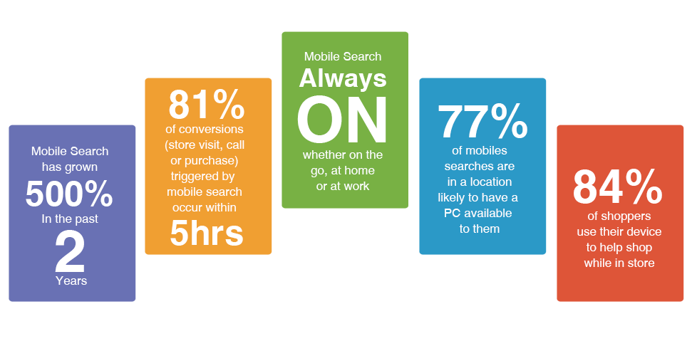
Mobile devices are the future of internet.
GTP - The No.1 Responsive Design Company in Bhubaneswar
If you are thinking of Maintaining separate websites for different machines than this is not a viable solution because each will ask for time, effort and money; Modern businesses are investing in responsive design because it minimizes effort and saves time as well as money. GTP offers the best Responsive Design Service with best price in Odisha. Our Designs are preferred by our clients with smile.
Time for text & design related changes
Effort to track performance & make amendments
unique quality which will make someone special
Do not miss to take our Responsive Designing
Request a FREE QuoteGTP - Responsive Design Technical Details
Responsive websites use CSS3 media queries, fluid proportion-based grids, and flexible images to create a visual experience that remains the same as screen size changes.
While most traditional websites fall apart on smaller screens, responsive ones adjust text, graphic and other elements as per screen resolution.
A website not optimized for smaller screens cannot cater to mobile users. Responsive ones can, and that too without compromising user experience.
As a company of responsive design experts, we make cutting edge websites that effortlessly fit all machines by adjusting resolution, image size and scripting.
Same URL
Single Content
One Code
CSS3 Queries
Responsive website
GTP - The Team of Responsive Designers
GTP has been active in the web services field since 2013 and our name is counted among the best responsive website design company in India and globally. With diverse experience and expertise we understand understands what is required to make futuristic websites that can dominate screen sizes of all types with minimum of resizing, panning, and scrolling.
Our design experts take strategy, UX & graphic design concepts to create responsive websites that offer a unique visual & interactive experience. GTP never compromise in making responsive web pages as it will give the best experience to users.
Here are some other things that are part of our day to day design and development processes :

Competitor
Analysis

Wire frame Design
& Prototyping

Information
Architecture Design

Usability
Testing

Expert
Evaluation
Resolutions we'll take care of
Mobile Portrait

(320x480)
Mobile landscape

(480x320)
Tablet Portrait

(360x640)
Tablet Landscape

(640x360)
Tablet Portrait

(768x1024)
Tablet Landscape

(1024x768)
PC Browser